
Cookbook shelves are crowded with homogenous covers. Most feature prominent photographs of the authors or pictures of dishes from within the book. In a sea of sameness, it was becoming more and more difficult to stand out.
This collection of book covers for Yotam Ottolenghi are consciously designed to be different. To be both disruptive and iconic. To convey everything the books offer boldly and immediately via their striking visual language.


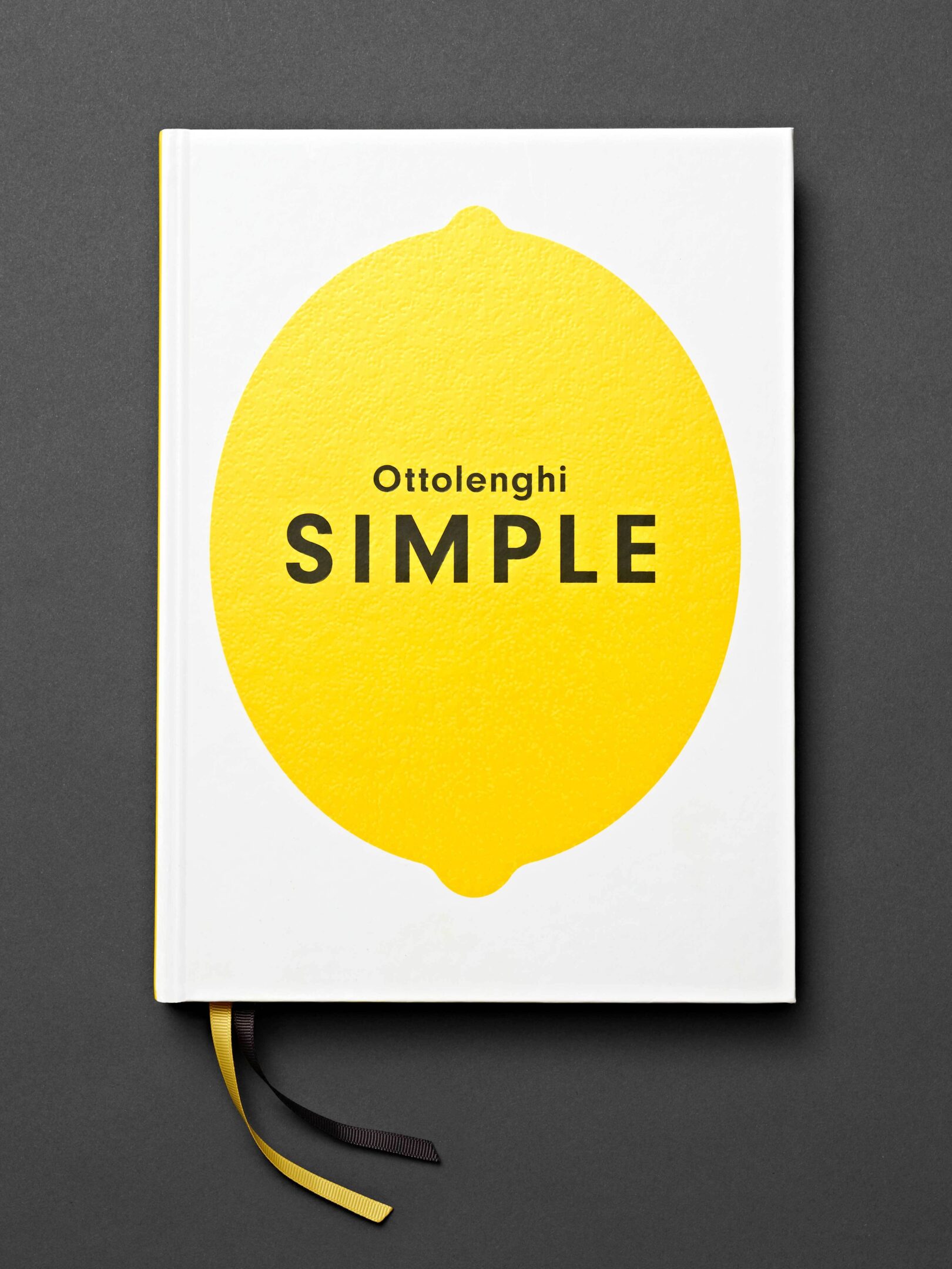
SIMPLE
The immediate story of an uncharacteristically simple collection of recipes from Yotam Ottolenghi. A cover designed as a true representation of what the book and its contents were all about.
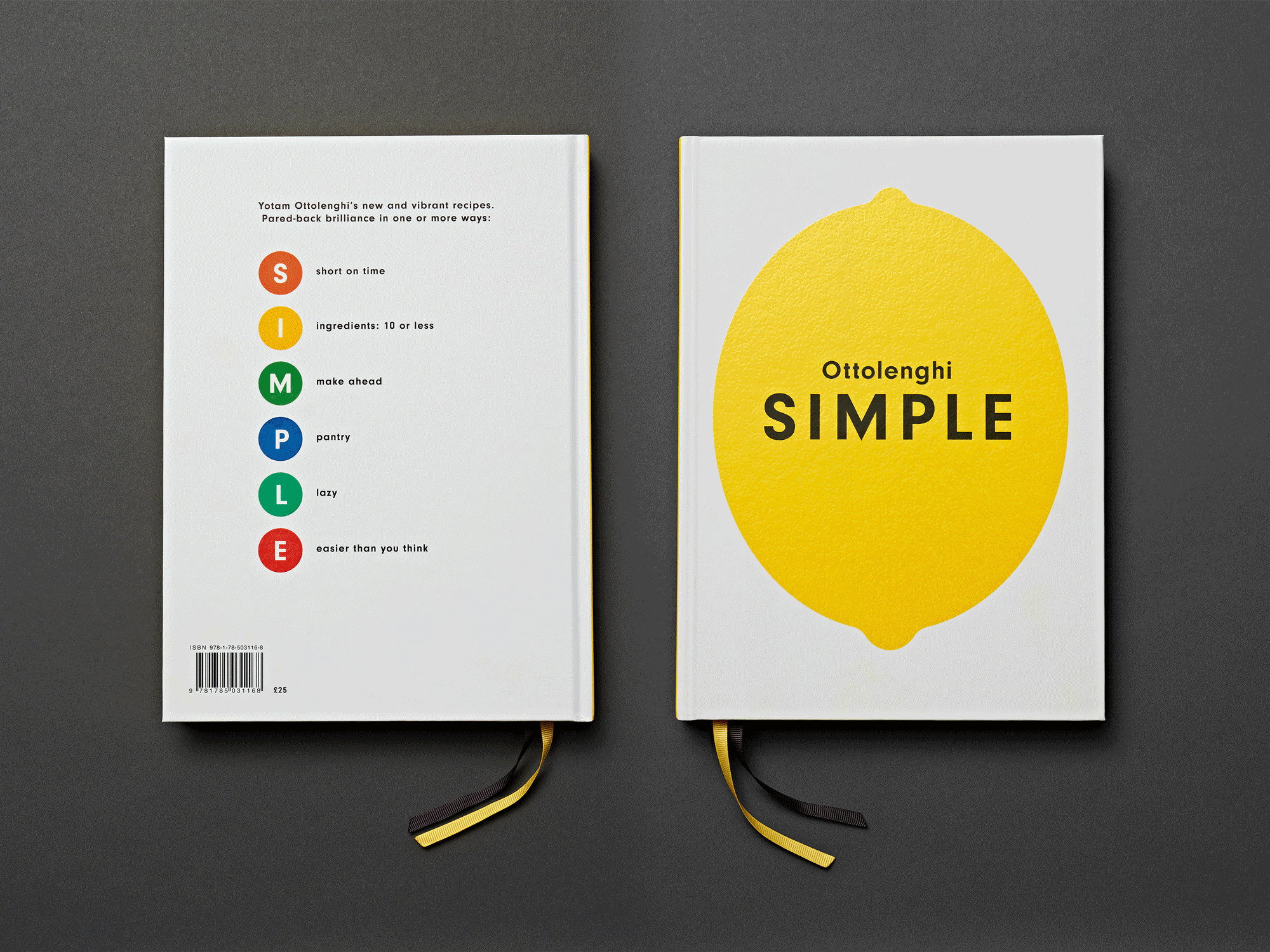
The strikingly simple lemon. Embossed to capture this vibrant fruit’s texture. Bright. Immediate. Appealing. And most importantly, simple. An open and clean sans serif typeface, with plenty of air and space around the text, reinforces the standalone simplicity. Yellow, white, black. A million miles from the multicoloured clutter of most cookbooks.